MealMapper

A cross-platform app that turns a week of meals into a sorted grocery list and a one-tap store order, built for two people sharing one kitchen.

React NativeExpoTypeScriptSupabaseKroger APIDesign System
MealMapper screenshot

Overview

We have three young kids who are picky eaters, and a standing goal of not serving chicken nuggets every night. So every Sunday morning my wife and I sit down and plan the week: what the family is eating, all seven days.

That part is fine. It is the next part that is miserable. You take those seven recipes, cross-reference every ingredient, consolidate the duplicates, remember you are already out of garlic, and then retype the entire thing into a store app that was not designed by anyone who enjoys using it. It is an hour of pure translation, every single week, forever.

So MealMapper follows one straight line and removes the friction at every step:

plan the week → auto-build the grocery list → order it, without retyping a thing.

The thing that forced this onto a real backend was simple: my wife and I needed a shared account. Planning only works if we are both looking at the same week, and a local app on one phone is just a worse version of the notepad we were already using. So MealMapper is built around a household rather than a user. Supabase handles auth, a Postgres database, and realtime sync, so both of us edit the same plan and the same list from our own phones and see each other's changes live.

There are two versions of this app in these shots. The first got the loop working and proved the idea. The second is what came back after other people used it. Both are here, because the distance between them is the actual story.

Plan a week of meals

The week is the home screen. Tap any day, and a picker opens with your whole meal library: searchable, filterable by how the meal cooks (Quick Prep, Slow Cooker, Rice Cooker), and with a Surprise Me button for the nights you can't decide. There's a month view too, for the weeks you want to plan ahead.

The week view with a meal planned for each day, tagged by cook style and prep time.
The meal library: search, tag chips, and shelves that build themselves from what you actually cook.

Every meal in one place

You shouldn't have to retype a recipe you found online. Paste a URL and MealMapper reads the page's structured recipe data, pulling the photo, ingredients, instructions, times, and servings into a clean preview before you save it. Pick a different hero image from the page's thumbnails if you like. You can also enter one by hand. Every saved meal gets Details / Ingredients / Cook tabs, a serving scaler that adjusts quantities, and a quiet "times made" counter that the library later uses to decide what belongs on your shelves.

Importing a recipe from a URL: photo, metadata, and a parsed ingredient list.
A saved meal with details, serving scaler, and a times-made stat.

A grocery list that builds itself

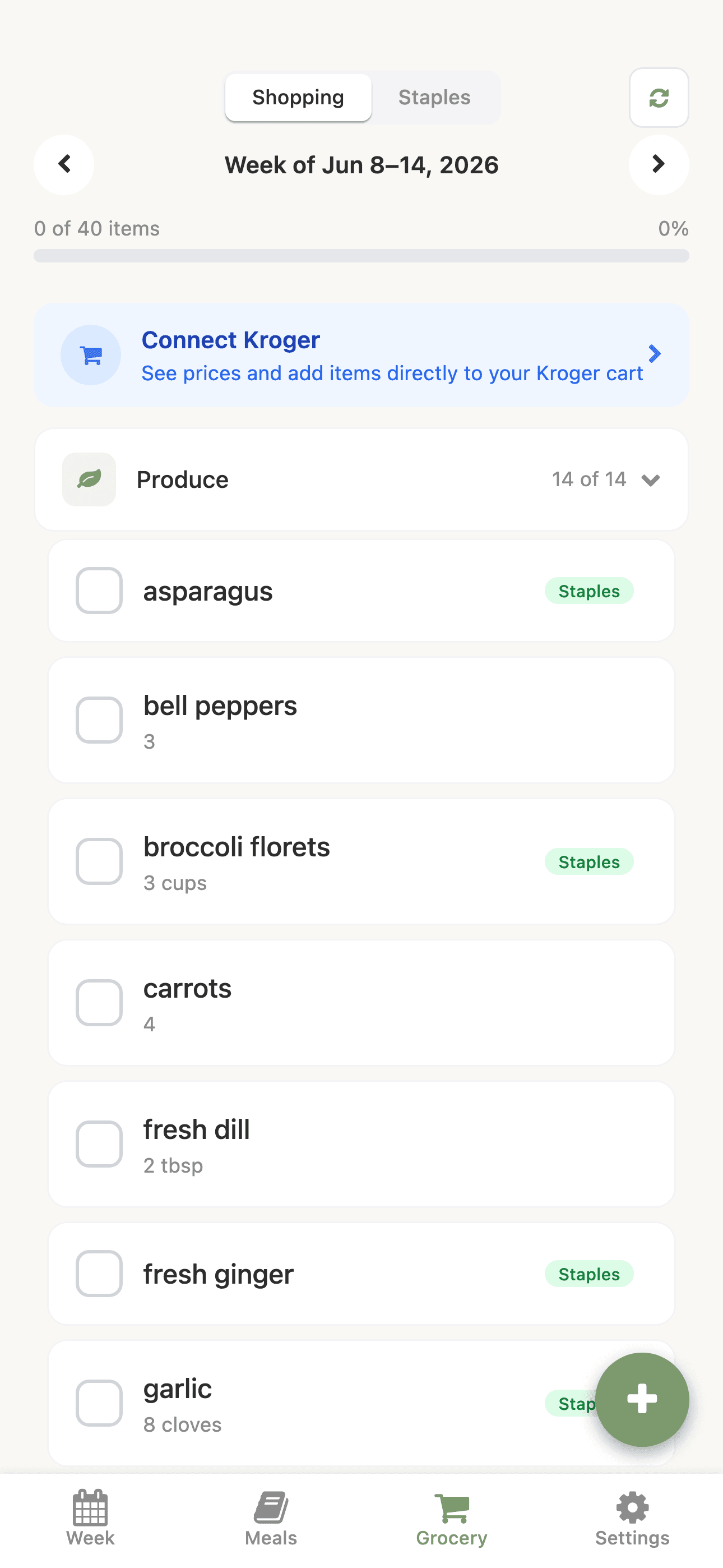
This is the step that used to eat the most time, so it's the step MealMapper automates completely. From the week's planned meals it generates one consolidated list, merging duplicate ingredients across recipes, carrying their quantities, and sorting everything into the order you actually walk a store: produce, bakery, meat, dairy, pantry, frozen. Pantry staples you always keep on hand are tracked separately so they don't clutter the run. Check items off as you shop, and because the list lives on the household, whoever's at the store and whoever's at home are looking at the same thing in real time.

The grocery list, consolidated from the week's meals and sorted by store section.

Order without retyping it

A finished list is only half the job. You still have to buy it. MealMapper closes that gap by connecting straight to the store. Link a Kroger account and it matches each item on your list to a real product on the shelf, with live prices, sale flags, and pickup-or-delivery availability, so you can confirm the exact thing you meant and send the whole cart to Kroger in one pass. Prefer Instacart? The same list hands off there instead.

V1 · Match Products
V2 · Match Items
The same item in both, matched against the same shelf. Version one gave every availability state its own color, so four hues competed on a screen whose entire job is comparing prices. Version two spends color once, on the thing you're actually deciding between.

Everyone who eats here

The shared account started as two logins on one plan. It turned into something more useful once I stopped treating the household as an account and started treating it as a list of people.

A member is anyone who eats at the table, which is not the same as anyone who can sign in. Our four-year-old is a member. She is never getting a password. So members carry an age range, dietary tags, and free-text notes, and separately a role and an optional link to a login. Adults get admin or member; the person holding the phone gets a You badge, and "this is me" moves that badge if the wrong seat is claimed. A login maps to exactly one seat, so claiming releases whatever it held before.

Inviting the other adult is a household code you share or copy, plus a waiting-on list of outstanding invites you can resend or revoke. The design I drew for it originally had the code counting down to an expiry. Household codes don't expire, so I replaced that line with the reset action people were really being reassured about.

The Members screen: initial avatars, role tags, the You badge, and the household invite code.

Did they actually eat it

Naming everyone made the obvious next feature possible, and it's the one that answers the question the whole app started from. Not "what are we having," but "did that work."

Any member can react to a meal: 😋 liked, 😐 fine, 🙅 nope. Meal Detail gains a Recipe | Verdict toggle whose label carries the running tally, so the count of who liked it is visible without opening the panel. Every row in that panel is tappable, not just yours, because these are the people at the table rather than app logins and somebody has to record the toddler's opinion. Tapping an active reaction clears it, since the realistic moment of use is a phone passed around a dinner table and mis-taps need to be undoable.

When every current member likes it, the meal joins the Clean Plate Club: a green ring on its card, a tilted badge, and an "all four" meta line in the library. A Clean Plate filter chip appears in the tag row, but only once something has actually qualified, so a new household never sees an empty promise.

Nothing about that is stored as a result. Fan counts and unanimity recompute from the current member list every time, which means adding a kid or removing a roommate re-derives the club correctly instead of leaving a stale trophy on a meal half the house dislikes. Verdicts are also entirely optional. A meal nobody has reacted to behaves exactly as it did before the feature existed.

The Verdict panel: one row per household member, each with liked, fine, and nope reactions.
A meal in the library carrying the Clean Plate Club badge and a green ring.

Where it stalled

I am going to be straight about this one, because the honest version is more useful than a tidy ending.

The store integration is the whole product, and only one store cooperated. Getting the Kroger connection working was the moment the thing felt real: a planned week turning into a matched cart with live prices. Then I went looking for the next store and found that most of them have no usable public API at all. Instacart has effectively cornered that ground by building an enormous front end to paper over exactly this gap, which is a lot of moat for a side project to argue with. We order from Harris Teeter, whose own app is unfriendly enough to have started this in the first place, so I was well aware of what limited reach would mean.

Then life did what life does. Work hit a busy patch, and three young kids plus a demanding job during a genuinely tough stretch does not leave much for a fifth project. I also spent an afternoon looking at how crowded meal planning is on the App Store and got discouraged. Standing out there was going to take far more time and energy than I had.

So it sat for six months. The lesson I took at the time was that I had picked the feature that depended on someone else's platform and made it the centerpiece. That is a fine bet when the platform wants you there, and a hard ceiling when it does not.

What handing it to other people changed

What got me back into it was not a better answer on the store problem. It was putting the app in front of friends and family and watching what happened.

Version one was a proof of concept, and it had been reviewed by exactly two people who already knew how it worked. That is the worst possible test. Everything I had built was legible to me, so none of it looked broken to me.

The list that came back was not about meal planning at all. People got stuck at the door: password reset was reachable but not actually completable, and there was no Google sign-in, so the first thing the app asked of a new person was to invent another password. The tab bar icons were decoration rather than signage. Emoji were doing the work of a real icon set. And nobody arriving at an empty week for the first time had any idea what to do with it, because the app explained nothing and just presented a blank grid.

Underneath that was a structural one. I had organized meals into collections: folder cards you tapped into, like a file system. Everyone I watched used them once, during setup, and then never opened them again. A folder is a container you have to maintain. Nobody wants a second job filing their dinners.

The second pass

So version two is two things at once: fixing what testing surfaced, and a full visual rebuild I had wanted an excuse to do anyway.

The design system is called Deep Teal & Mango. Dark is the default, a near-black teal canvas with a mango accent, hard black outlines and offset shadows rather than soft elevation, and Space Grotesk throughout. There's a light theme on the same tokens and a toggle in Settings. Every color lives once in a token file, mirrored into CSS variables for NativeWind classes and a JS palette for the inline and animated values, so the two themes are the same code path rather than two hand-maintained skins.

V1 · Collections
V2 · Tags and shelves
Folders you maintain became tags you apply, and the rest of the organizing happens on its own. The Clean Plate chip in that row wasn't configured, it appeared the moment a meal earned it, and shelves like On Heavy Rotation build the same way once a household has cooked enough to rank. A migration backfilled every old collection as tags, so nobody lost their filing.
V1 · Week
V2 · Week
Same information, restated. Outlined panels, a real type scale, and the day you're on carrying the accent instead of every card competing for it.
V1 · List
V2 · List
The list was already right. It just needed to look like something you'd hold in a store aisle.

The door got fixed too. Google sign-in, a password reset that completes and handles expired links honestly, auth emails styled like the rest of the app, a monochrome icon set replacing the emoji, and a four-slide tour on first run (Plan, List, Prices, Household) that shows a new person the loop before handing them an empty week.

Then there's the class of thing only real use finds. Recipe steps and ingredients could only be appended, so fixing a recipe you'd typed out of order meant retyping every row after the mistake. They drag to reorder now, on a hand-rolled list rather than a gesture library, because the app ships to web as well as native and pulling in a native-only dependency to solve a sorting problem was a bad trade. Long steps were also quietly clipping at the top and bottom, which nobody notices until they write a real recipe. And in the Kroger matcher, the last unmatched item couldn't be skipped: press Skip and the same item came back forever. Every one of those is invisible in a demo and infuriating on a Sunday.

It also finally got a mark of its own: a compass whose needle is cutlery, a mango fork pointing north-east and a cream spoon south-west, joined at a rotated-square hub. It's the app icon and, animated, the badge on the welcome screen.

The welcome screen with the animated compass brand mark.
The first-run tour: a tilted illustration card with a step badge and pill indicators.

Motion, on purpose

The other thing version one lacked was any sense that it was alive. Everything appeared instantly and sat still. That reads as cheap, and it also means nothing ever tells you what just happened.

So version two has five motion primitives and no more than five, each with one job: content rises in on mount with a staggered fade, confirmations pop past their final size and settle back, empty-state glyphs float so a blank screen still breathes, the add button wobbles just enough to be noticed once, and progress bars grow from the left. All of them are built on React Native's Animated API rather than a gesture library, so they run identically on iOS, Android, and the web build. Entrances fire once. Only the two ambient loops repeat, and prefers-reduced-motion freezes them.

Constraining it to five named primitives is what keeps the app from feeling busy. Every animation in MealMapper is one of those five, which means motion reads as a system rather than as decoration applied screen by screen.

The light theme, built from the same token set as dark rather than a separate skin.

Built on a real backend

Under the product-y surface, MealMapper is a single Expo + React Native codebase that ships to iOS, Android, and the web build linked above. State is split between a Zustand store for UI and TanStack Query for server data. Supabase is the backbone (auth, Postgres, and Realtime for the live household sync), and the parts that have to talk to the outside world run as Supabase Edge Functions: a recipe importer that parses structured recipe markup from arbitrary URLs, and the Kroger OAuth, product search, and cart endpoints (plus Instacart link generation) that make the one-tap order possible.

Where it stands

The store problem is still the store problem. One chain cooperates, the rest don't, and nothing in the redesign changes that. But the app my family actually uses every Sunday is now one that other people can pick up without me sitting next to them, which is the part I had wrong the first time.

The v1 lesson was about betting on someone else's platform. The v2 lesson is smaller and more useful: I could not see what was wrong with version one because I already knew how it worked. A handful of people using it for a week told me more than six months of my own judgment.

It's also no longer stalled. Members and verdicts both landed after the redesign shipped, and both came out of the same place: watching how the app gets used at an actual table rather than deciding from the outside what it should do next.

My role

Everything: concept, product and UX design, the design system and motion language, and the full-stack build, from the Supabase schema and edge functions through to the cross-platform app and this web deployment.

Live demo